|
Digital Humanities Workbench |
Home page > Tools > Data visualisation Data visualisationMany analysis techniques and tools discussed in this Workbench have a visualisation component, that can be used to make a visual representation of research data. Visualisation techniques may be used to show patterns that might not be visible from just raw data and to summarize and present analysis results in a clear and concise way. Here we give an overview of a the data visualisation techniques that are used in humanities research, as part of different analysis techniques.
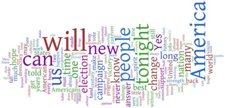
Text vocabularyThere are various ways in which the vocabulary of a text can be represented visually. A word cloud, for example, is a graphical presentation of word frequency in a textual source. Wordle is an example of a so-called word cloud generator. Word cloud showing word use in Obama's acceptance speech in Chicago in 2008. In a word cloud, the more frequently-used words appear larger. You can change the font, layout or color scheme of the cloud. Other visualisation techniques for text vocabulary are the word tree, which shows words or phrases in context, where the tree structure can reveal recurring themes and formulations, and the word plot, which shows where certain words are used in a text. A text analysis tool like Voyant Tools offers many of these visualisation techniques, of which tools index gives a neat overview.
Quantitative dataWhen presenting scientific research, freqency data are usually given in tables, so that both the researcher and the readers of the resulting publication can have a complete and unbiased overview of the data in question. Sometimes it can be useful to present data in graphs, such as line charts, pie charts or bar charts. This is usually done in presentations and posters rather than in scientific articles. Graphs, however, also lend themselves to manipulative forms of data presentation (through the relationship between the X-axis and the Y-axis, for example, or the starting values of X and/or Y).Software that can be used to generate tables and graphs includes Microsoft Access (has relatively limited functionality and is primarily used when all research data is already in a database anyway), Microsoft Excel and SPSS.
Spatial and temporal informationSpatial and temporal information is usually visualised with so-called GIS tools, where GIS stands for Geographical Information System.
Example: State-Level Popular Voting in Presidential Elections, 1840 - 2008. This map plots the winning candidate's party by state throughout presidential elections, illustrating state-level visualisations of electoral returns. [source: Voting America: United States politics, 1840-2008]
A geographical information system (GIS) consists of
two basic parts: a digital (historical) geographical map linked with a database containing data with geographical coordinates.
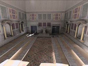
Object reconstructionWith digital technology, it is possible to create reconstructions of, for example, objects, buildings, landscapes and cities in 2, 3 or even 4 dimensions. This involves advanced techniques that are also used in for instance the film and computer game industry. In humanities research, these techniques are used in archaeology, art and architecture research and historical research. For more information about historical applications, see The Virtual World Heritage Laboratory.
Example of a digital reconstruction: The Senate (Curia Julia) - Rome Reborn Project. The upper part of the hall is empty because there is no (proven) data available for that part. [source: http://www.romereborn.virginia.edu/]
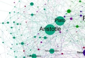
Network relationshipsStudies sometimes aim to identify network relations, for example as part of prosopographical research, which involves mapping the external characteristics of a well-defined group of people and subjecting these characteristics to quantitative analysis. Mapping the networks of the population being researched is almost always a part of the study. Network analysis can also be a part of biographical studies, however.These studies often aim to investigate relationships between people, between institutions, or between institutions and people. The more complex the relationships are, the more difficult it becomes to identify them in the data 'by hand'. There are various computer programs that can be used to trace such networks on the basis of one or more files in which the data are stored in a structured manner. Freeware tools that can be used to create these networks are gephi and NetDraw. Detail - click the image to see the whole graph Example of a network graph by Simon Raper, who use the 'Influenced by' section for every philosopher on Wikipedia and used it to construct a network describing the links between philosophers. [source: http://www.coppelia.io/2012/06/graphing-the-history-of-philosophy/]
Further readingData Visualisation linksPage from the Digital Panopticon Project giving many useful links to information about data visualisation in humanities research. |
Other topics in this section: Introduction Tool list VU Programming Database XML |


